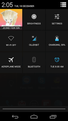
I am very unhappy with the new settings shortcuts with Jelly Bean 4.2. When I first heard that settings shortcuts would be added, I was excited. I thought, "Finally!". But what the hell is this, Windows 8?
 |
| Jelly Bean 4.2 Settings Shortcut in Action |
1. Needs more taps to get to, and also, confusing.
The existing common implementations of this from Samsung/LG/PanTech or custom ROM makers were usually showed this on the top of the notification menu. All frequently accessed items were just one swipe away, and for seldom used items, just one more swipe.With the Google's implementation, I have to swipe down then I have to press the settings icon (I do not know what it is called) at the top right of the screen. The problem is that Google removed colours from the notification menu icons so everything looks white and at the very vicinity of the shortcut icon is the clear notifications button. The two icons usually confuses me, so I happen to press the other by mistake.
I know I can open the settings shortcuts using two fingers, I found myself not using two fingers that often for this.
2. Settings cannot be toggled or changed on that screen.
I used to change brightness or toggle screen rotation using the notification menu. It only took one swipe and one more swipe (or one tap). Now it takes one swipe, one tap, one tap, and one swipe (or one more tap). In short they are not toggles, they are just shortcuts to the settings menu. Why, for God's sake? The whole merit of the menu was quick toggle. Google's implementation just lost that.
3. Items cannot be customised.
Items are fixed. They cannot be reordered, changed or removed. Only limited settings are available and there is not even screen rotation lock item -- which I use often.
4. Ugly and not utilising the screen.
What is this, Windows 8? If you wanted to be Windows 8, why could you not make it more informative like Live Tiles? For example, the brightness icon shows always the same icon with the same name "BRIGHTNESS". Why not different icons (dark, half-fill, fully-filled icon) and brightness percentage? Why not the 3G icon show the allowed data left till the warning level (like, 3GB left )?
There are lots of blank space on the bottom... Could you not add brightness horizontal bar as other OEMs did in the blank space?
Learn from the third parties.
It looks like the engineers of Google programmed this in a few days WITHOUT having any feedbacks from users and the UI designer just wanted to make things like Windows 8. I used to be and still have been a huge fan of Google, but recently Google is disappointing me. I am currently very tempted to change to iPhone.
If this shortcut menu were introduced as it is in Android 2.0, I would not have criticised much. But, this is Android 4.2 and the third-party notification menus have been there for at least 2 years. There are different flavours of this notification menus (some called power widgets) and many people showed genius ideas (like normal tap toggles, long tap gets into the settings), horizontal scroll to control brightness and so on. And I believe they are all open-source. Why could Google not learn from them?
Get back to the drawing board, Google.
No comments:
Post a Comment